 |
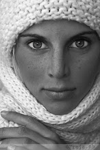
| Eduardo in stormy weather with the letter O |
Finally I'm in school with quick internet! Sorry for so many posts in the same time! Hope you'll catch up!
Today we handed in the brochures "Giants of Typography" - I'll post some pics on that later. After that we got a new brief in Typography & Context, called "Letters in the environment". In class, we got a huge letter in black on an A2 paper, with a white background. The assignment is to photograph the letter in a creative way and turn the whole thing into a big real poster for a fictional exhibition, where we have already got all the copy that needs to be on the poster, from the teachers. The project is due in a couple of weeks, and the poster is to contain only two colors, for example duo tones. In two weeks we will bring in the three best ones each, for feedback on the "wall of death". We're in groups of three and every group gets a different letter. We got "O". Fun project!


1 comment:
Haha, ja O måste ju vara en av de både svåraste och lättaste bokstäverna att jobba med. Kan tänka mig att G eller R inte är lika roliga.
Post a Comment